Usually I don’t have enough time for painting – there’re millions of jobs that need doing and a constant illusion that once these are done I’ll be able to do something that I enjoy. Needless to say, the stream of jobs is never ending… so I simply have to MAKE time.
What does it look like? Well, I wait till I can’t wait any longer and then stomp my feet and announce that I’m busy. I also try to shut my mind off, because if I didn’t do that I’d be constantly worrying that there are far more important things I should be doing.
What about the inspiration? One could argue that with such an artificial “making of time” there’s no space for it, but I’d say that the emotion is being accumulated for a long time and then results in a better outcome. If I could drop things whenever I’m inspired by something I see, by now I’d have about a thousand paintings, but I’m not sure I’d be happy with the result.
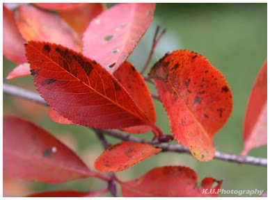
Well, this time I must have been seeing too many bright colours – green and red apples, orange chilies, yellow and violet plums… This kept building up and exploded one afternoon on a square canvas. (You have a rare opportunity to see what it looked like in reality and then probably to think I’ve gone a bit mad with the colours afterall…)

So what do you make of it? At the time I was painting everything seemed right, but now even I think it’s too bold! Anyway, just for fun, I turned to the psychology of colour and had a look at the basic meanings of colours and if there’s anything that could be applied.
 Red: If you want to draw attention, use red. It is often where the eye looks first. Red is the color of energy. It's associated with movement and excitement. Red is not a good color to over use but using a spot of red in just the right place is smart in some cases (one red accent in a otherwise neutral room draws the eye; a red tie with a navy blue suit and white shirts adds just the right amount of energy to draw the eye. Red is the symbol of life.
Blue: Ask people their favorite color and a clear majority will say blue. Much of the world is blue (skies, seas). Seeing the color blue actually causes the body to produce chemicals that are calming; but that isn't true of all shades of blue. Some shades (or too much blue) can send a cold and uncaring message.
Green: The color of growth, nature, and money. A calming color also that's very pleasing to the senses. Dark forest green is associated with terms like conservative, masculine and wealth. Hospitals use light green rooms because they too are found to be calming to patients. It is also the color associated with envy, good luck, generosity and fertility. It is the traditional color of peace, harmony, comfortable nurturing, support and well paced energy.
Yellow: Cheerful yellow the color of the sun, associated with laughter, happiness and good times. A person surrounded by yellow feels optimistic because the brain actually releases more seratonin when around this color. It is the color associated with optimism. It has the power to speed up our metabolism and bring out some creative thoughts. Some shades of yellow are associated with cowardice; but the more golden shades with the promise of better times.
Orange: The most flamboyant color on the planet! It's the color tied most this fun times, happy and energetic days, warmth and organic products. It is also associated with ambition. There is nothing even remotely calm associated with this color. Orange is associated with a new dawn in attitude.
Right... So the painting is sending on one hand cold an uncaring (blue), on the other happy and optimistic (yellow) message. As these too meet down the middle could we say there's some balance? Not too much red and enough orange - warm and energetic, oh, and ambitious! Also hopefully a new dawn in attitude. And the light green? I hope it's for good luck.
 I haven’t been stressed (not yet; wait till it really is nearly Christmas and I start panicking I haven’t got all of the presents), so I haven’t stopped. On the contrary, my blog has been neglected just because I’ve been trying to do too much: preserving autumn in between an old book’s leaves, knitting long warm scarves, painting pomegranates and still getting the garden ready for the immobilizing cold.


 So what do you make of it? At the time I was painting everything seemed right, but now even I think it’s too bold! Anyway, just for fun, I turned to the psychology of colour and had a look at the basic meanings of colours and if there’s anything that could be applied.


